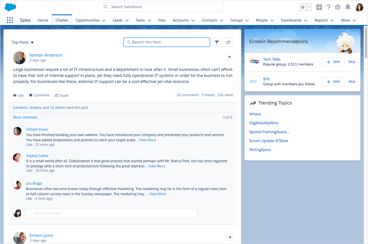
In-Context Search
With in-context search, users can refine content on a page to find the correct information without having to context-shift and navigate away when using global search. Core examples of in-context search are in list views and feeds.
Default State
Place the in-context search directly above the content the user is refining. To help increase discoverability, the input should be exposed, not hidden behind an icon the user must click. The input should have a smaller UI footprint than global search to reinforce a visual hierarchy.
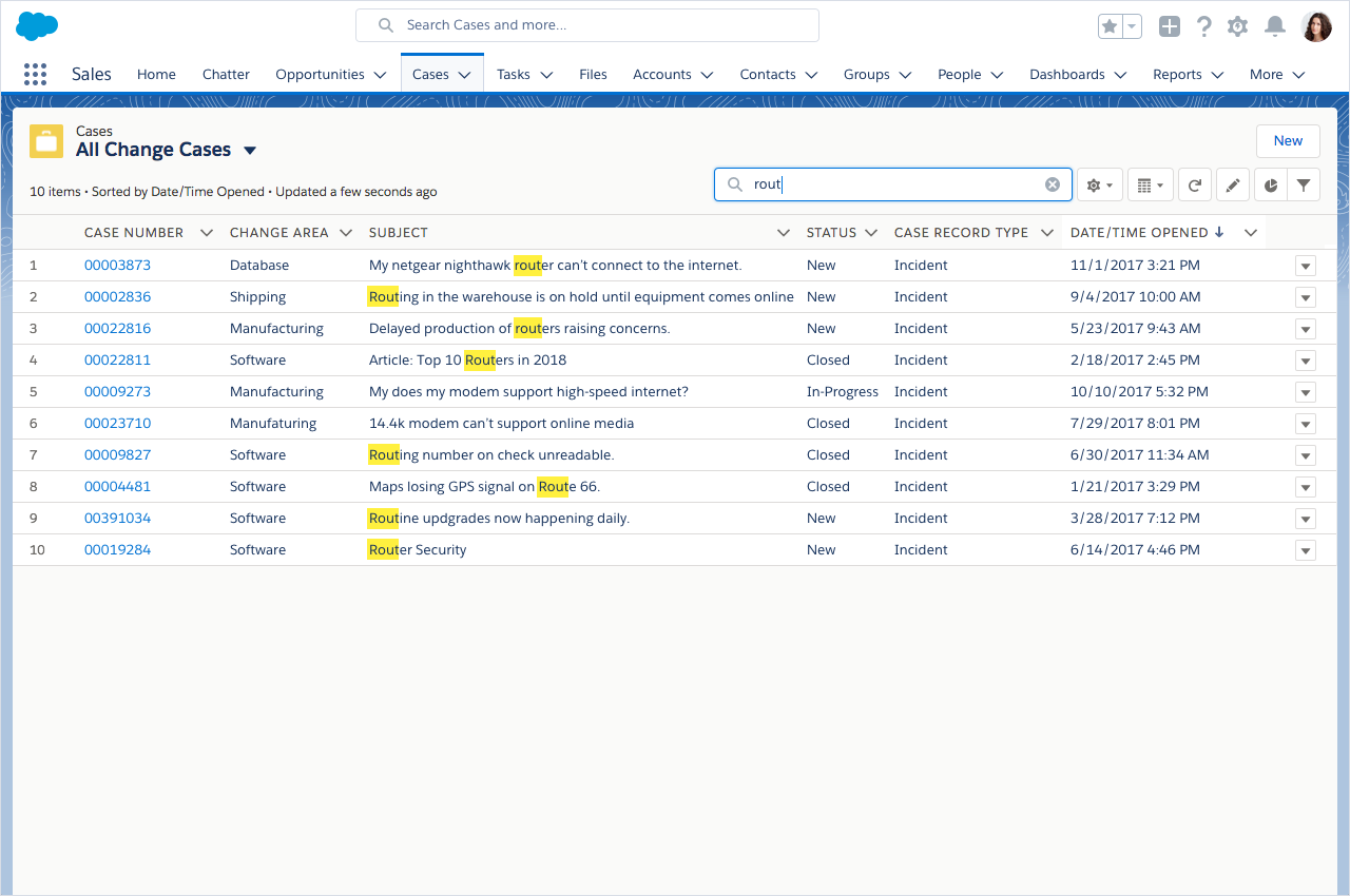
For example, when viewing a list, the in-context search input should be placed above the list and exposed by default to highlight the ability to search the following list specifically.
Placeholder Text
Placeholder text tells the user what to expect, and in-context search is a place where specificity matters a lot.
Specificity
When searching a feed, your placeholder should be "Search this feed...", instead of "Search...". When searching a list of accounts, use "Search this list..." instead of "Search Accounts...". Specificity matters because:
- Users expect in-context search to only search the content they're browsing now.
- "Search Accounts..." tells the user that their Accounts will be searched, but will all Accounts be searched? Some of them? Which ones? Paying attention to placeholder specificity increases clarity for everyone.
- Feeds have different views and the same guidance applies here. Let the user know that this feed will be searched.
- Keeping the placeholder text & behavior consistent in different contexts transforms into intuitive behavior.
For lists and feeds, the placeholder text should always read "Search this feed..." and "Search this list..."
Focus
The search input takes on the active styling, and since we're refining a list of information already on the screen, an autocomplete menu isn't necessary to display.

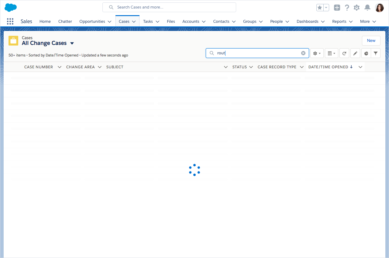
Instant Results
When there isn't an autocomplete menu giving the user instant results, this efficiency should be extended to the context of environment they're searching in. As the user types, results should start to be returned without having to press the ENTER key.
Feedback
When results are being returned, give the user feedback to tell the them that we're working on their request. The content in the feed is replaced with stencils as one layer of feedback, but customers have said that with a slow connection, stencils alone aren't enough to tell them that there's something happening in the background... some think their computer could be frozen, others think they might need to refresh their app. Showing a spinner in the input is an additional form of feedback that tells the user we're still working.
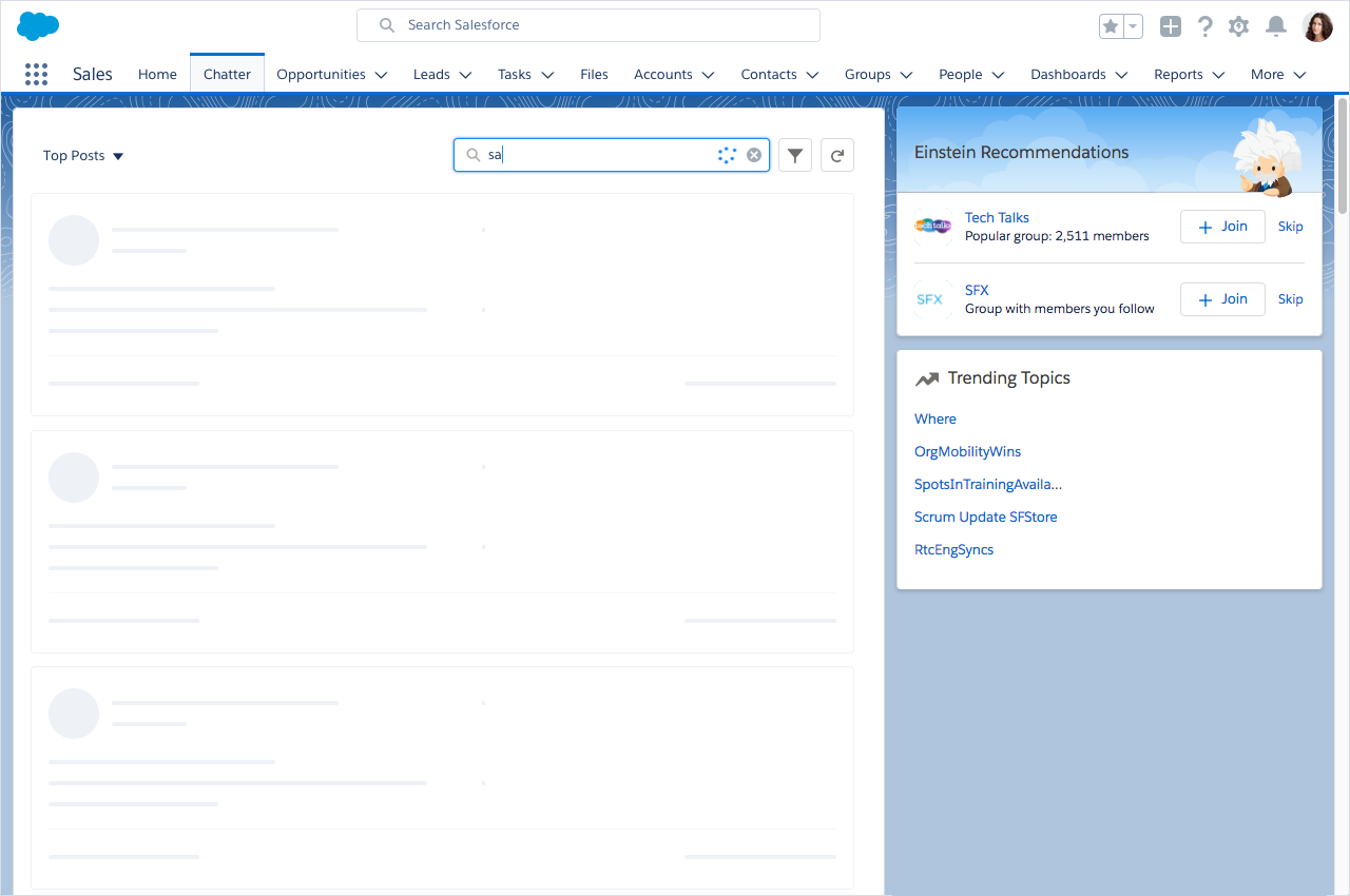
Feedback on a list search already displays a spinner on top of their stencils so a second spinner in the input is avoided in this context.
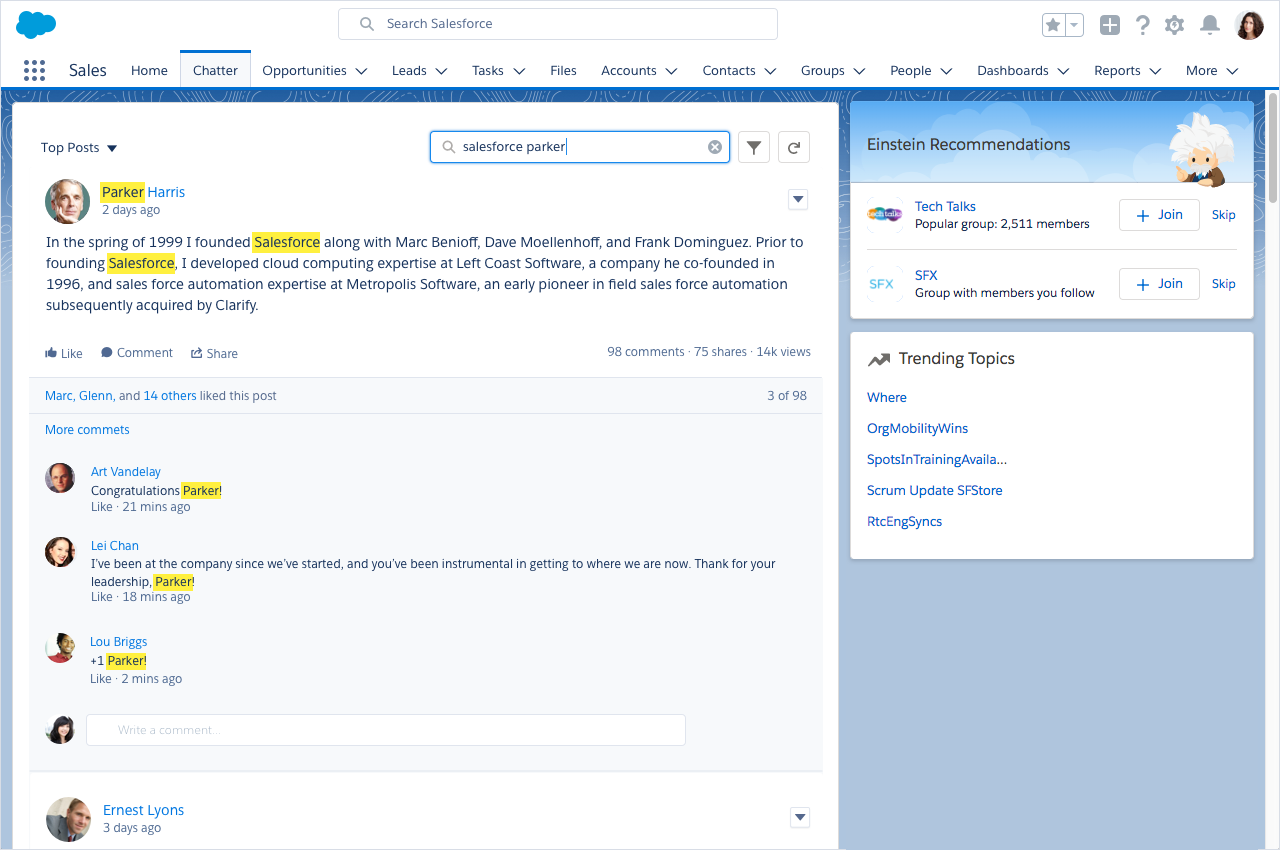
Results Highlighting
Results should guide the user to the most relevant information in their results. To do this, use background color highlighting for the matched terms.
Avoid using snippets, which truncate long bodies of text to only show your matched character and its surrounding words. This is a valuable feature for finding Articles, but it hides important context from a feed post. customers have said that they need the full context so their comments aren't inaccurate.
Highlight anywhere there's a match, including the name of the poster or commenters, the body of the post, the comments, and attachments. When a user clicks on the publisher, expand all comments to give a full context of the conversation.