Notifications
Guidelines
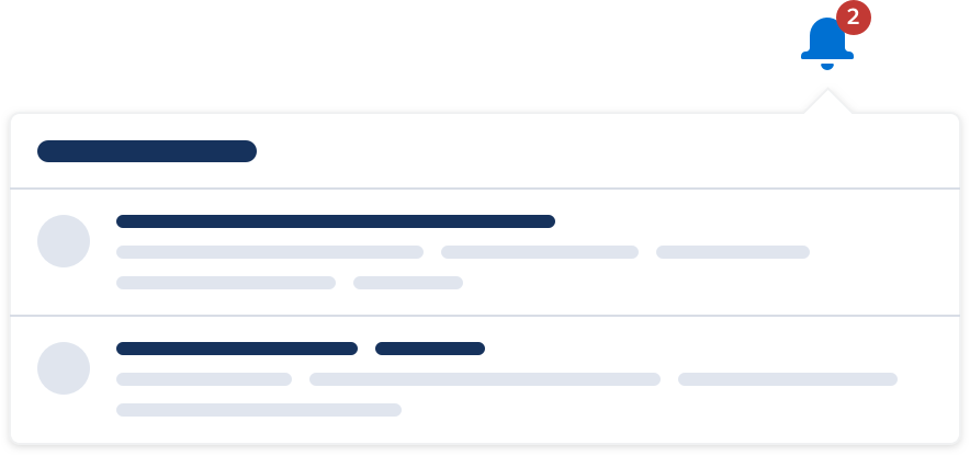
Notification informs users of relevant activities across the board by surfacing actionable information & shortcuts.
Usage
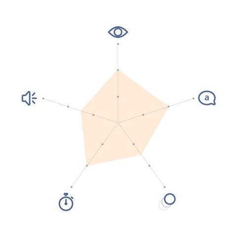
- Visual: Visible
- Voice & Tone: Informational
- Motion: Static—Delicate
- Duration: Dismissible
- Audio: Muted—Soft (or Vibrate)
Notifications let the user know when there are updates to items that are relevant to them. This includes the following:
- @ me. A user’s name is mentioned in an item, or an item is assigned to the user.
e.g. Sally Smith mentioned you in a comment: “@John Doe can you post…” - Custom criteria. An item meets the custom criteria set by the user.
e.g. let me know when this opportunity reaches “negotiation” stage. - Approval. A user needs to approve an item, or the user’s requested approval is completed.
e.g. you need to approve a 15% discount for “ACME - 100 widgets.” - Reminder. An event or deadline is coming up.
e.g. you have 7 days left to update your health insurance information. - Process update. A process that the user initiated is either successfully completed or has errors.
e.g. data import is complete. - Product announcement. The application needs to inform the user of product-related news.
e.g. read the release notes for Summer ’17.
Notification is composed of two elements:
- Icon: shows a counter with the number of unread notification items.
- Tray: contains all the notification items that the user has received.
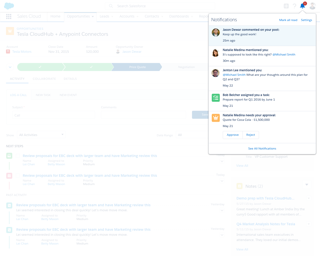
The notification icon resides in the header and clicking on it toggles the tray on and off. When a new notification item comes in, a counter will be added to the icon; when there are multiple new items, the counter is updated accordingly. Each notification item in the tray links to the affected item respectively.
A notification item can show one of the following states:
- Error: when a process that the user initiated (e.g. data import) has errors.
- Informational: when a relevant activity happens in a different part of the application. This will be the case for most notifications.
- Success: when a process that the user initiated (e.g. data import) is successfully completed.
Notification in Context
Dos and Don’ts
Do
- Do include inline actions when appropriate, so the user can resolve an item immediately; e.g. a record needs your approval - “approve” or “reject.”
- Do allow user to mute individual notification items.
- Do batch notifications for the same item to minimize noise.

Do Not
- Do not use notifications as a feedback mechanism. Look into inline text, popover, toast, or modal instead.
- Do not treat notifications as a single source of all activities. Notifications are highly customizable and a user may choose to mute certain items.
- Do not overload the user. Be selective with what you choose to send via notifications.
- Do not include multi-step actions in a notification item. Include only one-step actions, e.g. approve or reject, check off task, etc.
Variants - Component
- Description of icon
- Description of icon
- Description of icon
Variants - State
A notification item isn’t displayed differently whether it’s showing an informational or success message. It will still have component states (unread, hover, etc.), however.
Variants - Screen Size

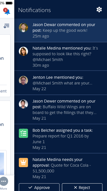
In mobile, the notification tray acts a little differently from its desktop equivalent. Instead of floating above the page, the notification tray in mobile slides in from the right to reveal the items.
Additionally, keep in mind that depending on their settings, a user may receive OS-level notification on their phone when they are not in the application.
Recommended Specs
Refer to this code sample for the notification markup.