Localization
Salesforce is committed to providing a high-quality experience to international customers.
Introduction
“Internationalization (i18n) is the process of designing a software application so that it can potentially be adapted to various languages and regions without engineering changes. Localization (l10n) is the process of adapting internationalized software for a specific region or language by adding locale-specific components and translating text.”
Here are a number of guidelines for writing content for international audiences:
Think About Global Users
Be Aware of the Cultural Significance of Colors
For example, the color red is associated with warning and danger in Western cultures, while it symbolizes luck and happiness in some Asian cultures, like China and Japan.
Avoid Using Flags to Represent Languages
Language and country are different concepts. Flags are symbols that represent countries or nations while languages represent a shared method of communication between people. For example, Spanish is spoken in 29 countries and Spain is only one of them. Countries like Canada have more than 1 official language. Which language do you think the maple flag represents?
When designing a language selector, use plain text despite its lack of visual appeal. Only use flags to represent countries, not languages.
Design for Text Expansion
When English text gets translated to another language, the translated text can be as much as three times longer. Leave blank space around condensed UI components, such as buttons and tabs.
Make UI components expandable whenever possible. Do not assign a fixed-width or height to your UI component unless you have a good reason.
For longer text, wrapping is a good solution. Be aware of the potential vertical expansion since translated text will take more lines.
Truncation with hover text can be a compromise. Be aware that this brings the risk of making the UI less effective.
Make Label Text and Inline Forms Independent from Each Other
Another typical UI pattern that introduces a localization issue is the use of inline forms such as input fields or dropdown lists in the middle of a sentence. This problem is caused by the fact that most languages do not follow the same word order as English. Due to this fact, the inline forms need to be repositioned to accommodate correct sentence structure in translated text.
When “From DATE1 To DATE2” is translated into other languages, for example Japanese, the word order will change to “DATE1 から、DATE2 まで” (DATE1 From DATE2 To), which will cause grammatically incorrect translation unless we reposition inline forms in Japanese specifically. This will require language-specific CSS, which increases complexity.
Since repositioning inline forms per language is not practical and adds CSS maintenance costs, we suggest avoiding any UI components in the middle of a sentence. If you have to, consider using a colon to connect the label and UI component and try to make the label a full sentence. In the previous example, we can use “Start: DATE1 End: DATE2” to make the label more independent.
Make Your CSS Localization-Friendly
Avoid Forced Capitalization in CSS
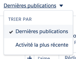
Capitalization can be very tricky, even in English. There are different rules for capitalization at the title, header, and sentence level. These rules keep changing. In most English style guides, almost every word in a title or heading is capitalized except for articles and prepositions. Here is an example of dropdown in Chatter Feed. Every word in English is capitalized:

In French, however, only the first word is capitalized. This also applies to other continental European languages (Spanish, Italian) and Nordic languages (Danish, Finnish, Norwegian). In fact, in many languages, capitalization is used less than in English. For example, a language’s name, calendar months and organization names are capitalized in English, but none of these are capitalized in French.
Due to these differences, it’s important that a developer avoids using CSS to handle capitalization. Leave capitalization up to the translators since they are the experts when it comes to styling rules in their own languages.

Enforce Text Alignment in a Smart Way
Text alignment is a common styling in CSS and is widely used for UI text in components such as buttons, menus and tabs. As in text editors where you can use space to center a text, in CSS you can center text by adding padding to a component. But a simpler and more localization-friendly way is using CSS text align property.
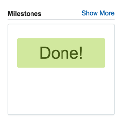
Here is an example of a case record from Milestone Tracker. The word “Done!” here is centered by adding a 40-pixel padding to the left and right as well as a width.

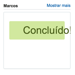
This looks perfect in English; however, when “Done!” gets translated into Portuguese, the text becomes longer and begins to overflow.
The hassle-free way to handle alignment is using the CSS text-align property, which is a better solution than moving text over using padding.

Text Length and Size Expansion Considerations
When UI text gets translated into another language, the text length often changes. For example, English is a very compact language, leading to longer translated text in most cases.
The general rule for text expansion is: “the shorter the English text, the longer the translated text is likely to be”. The following table shows the average text expansion rate for different English text lengths from IBM’s localization guidelines:
English Text Length | Expansion |
|---|---|
| 1 - 10 | 100 - 200% |
| 11 - 20 | 80 - 100% |
| 21 - 30 | 60 - 80% |
| 31 - 50 | 40 - 60% |
| 51 - 70 | 50 - 70% |
| 71+ | 30% |
In addition to English text length, the target language also has an impact upon the amount of expansion. The following table shows the expansion factor for the English text “Share” into various languages:
Language | “Share” | Expansion Factor |
|---|---|---|
| English | Share | 1.0 |
| German | Freigeben | 1.8 |
| French | Partager | 1.5 |
| Spanish | Compartir | 1.8 |
| Italian | Condividi | 1.7 |
| Japanese | 共有 | 0.8 |
| Chinese | 共享 | 0.8 |
| Korean | 공유 | 0.7 |
In general, Asian languages are more space-friendly since they tend to be more compact than European languages. But there’s no “always”. CJK (Chinese, Japanese and Korean) languages have more complicated characters than Latin characters and their characters tend to be more square, thus taking more horizontal space. Japanese is especially problematic due to it’s use of Katakana for transliteration of foreign words. For example, “Follow” in English and Japanese both have 6 characters, but Japanese is 20% longer than English due to wider characters.

